Beyond the Bell Curve: Why Markets Don't Follow Dice Laws (and the Math Behind It)
Dice follow the Bell Curve; markets do not. The standard Normal model dangerously assumes constant volatility and mathematically erases the probability of extreme crashes. To capture reality, true quants combine GARCH to track how volatility clusters and the Student-t distribution to measure the devastating "fat tails" of the crowd.
In statistics, we are taught a comforting concept: the Gaussian distribution is the ultimate truth of the universe. We are told that if we just gather enough observations, the noise of any random event will eventually smooth out into a perfect, predictable Bell Curve. But if this mathematical engine is truly that powerful, why does it fail so spectacularly when applied to financial markets? And if the Gaussian curve cannot map the chaos of trading, what can?
To understand complex systems, I believe you have to break them apart. We cannot just memorize formulas; we have to strip them down to their absolute fundamentals. Let's take a deep dive into the true machinery of probability theory.
Everything starts innocently. we take two dice, throw them, and record the sum. If we do this 100 times, we don't get chaos; we get a peak at 7.

Why? Because nature is efficient. There are 6 ways to make a 7, but only 1 way to make a 2. At this stage, probability is just counting.

But imagine throwing billions of dice. Those jagged bars in your histogram start to lose their edges. As the number of dice approaches infinity, the discrete "steps" vanish, and you are left with a silky, smooth curve.

Mathematicians call this the Central Limit Theorem. We can call it the "Taming of Chaos." But a profound question arises: What is the mathematical blueprint of this curve? Why does it look exactly like this, and not like a triangle or a rectangle? Before we focus on the formula, let's try to create the same curve from scratch.

The Evolution of the Bell Curve: From Chaos to Order
To understand the Gaussian formula, we have to build it from scratch. We start with raw mathematical power and progressively constrain it until it behaves like a perfect probability distribution.
1. The Engine of Continuous Change:
-
The Problem: The blue curve () represents pure, unchecked compounding growth. As you move to the right, it explodes to infinity.
-
The Reality: A probability distribution cannot explode. The total area under the curve must equal exactly 1 (representing 100% certainty). If our function shoots to infinity, it’s useless for modeling probability. We need to hit the brakes.
2. Reversing the Engine:
-
The Fix: By adding a negative sign, we flip the growth into decay. The green curve () represents exponential decay. As gets larger, the probability drops toward zero.
-
The Flaw: It only works in one direction. If you move to the left (negative numbers), the double-negative makes it explode to infinity again. Furthermore, it is completely asymmetrical, while random noise in nature is usually symmetrical around an average.
3. Forcing Symmetry:
-
The Fix: We introduce the absolute value function. Now, whether you go left or right from the center, the function decays equally. The red curve () gives us symmetry. This is actually known as the Laplace distribution.
-
The Flaw: Look at the peak at . It is a sharp, jagged spike. In calculus and machine learning optimization, sharp corners are a nightmare because they are not smoothly differentiable—you cannot easily calculate a gradient at that peak. Nature, and specifically the accumulation of random variables, prefers smooth transitions.
4. The Smooth Anchor:
-
The Masterstroke: We replace the absolute value with a square . Squaring a number inherently makes it positive, maintaining our symmetry, but it does something much more profound.
-
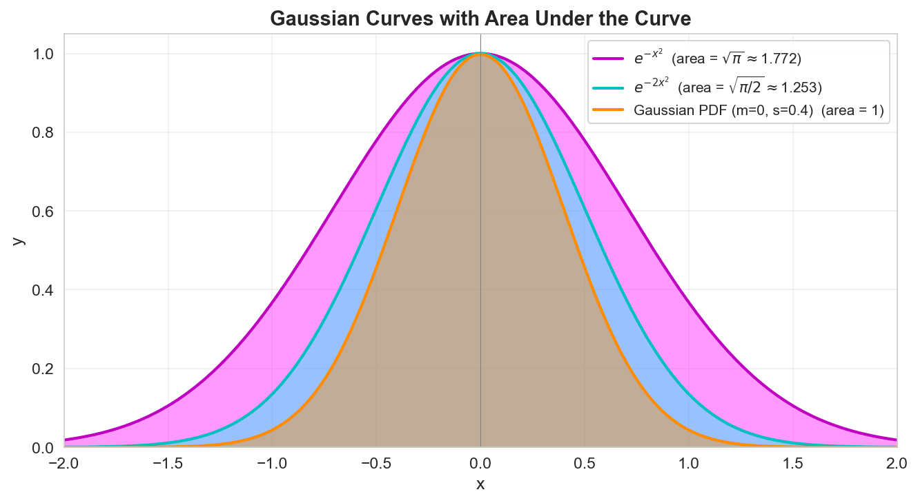
The Result: The purple curve () is smooth at the top. The derivative transitions flawlessly from positive to negative. Additionally, the term acts as a ruthless quadratic penalty. At , the decay is . But at , it is . This aggressive "braking system" forces the tails to hug the zero line tightly, creating the core structural DNA of the bell curve.
5. Controlling the Spread:
-
The Need for Flexibility: The purple curve is great, but it has a fixed width. What if we are modeling something highly predictable with very low variance?
-
The Fix: By multiplying by a constant (in the cyan curve's case, 2), we control the width. A higher multiplier compresses the curve, pulling the tails in tighter. In statistics, we define this spread using standard deviation ( or ). We write this structural exponent as . Dividing by stretches or squeezes the curve, and the is a mathematical convenience that makes the derivatives cleaner when calculating variance.
6. The Final Polish:
-
Shifting the Center: Not everything revolves around zero. We introduce the mean ( or ) by replacing with . This simply slides the entire orange curve left or right along the axis.
-
The Volume Trap (Normalization): As we established, the total area under a probability curve must equal exactly 1. If you take the integral of our core engine , the area is strictly . To force the area to be 1 regardless of how wide or narrow our spread () is, we must divide the entire function by its total area.
-
The Result: We multiply our engine by the normalizing constant . The emerges purely from the geometry required to calculate the area of that exponential hill.
But I have a new question, why e rather than any other number, what makes e special? To solve this mystery now let's understand the calculus and derivative.
Here is the draft for this section. It is written to perfectly match the tone of "The Quant Notebook"—blending clear mathematical intuition with the philosophical "why" behind the formulas. You can drop this directly into your article right alongside those images.
The Search for the Perfect Engine: Why ?
When modeling dynamic systems—whether it is continuous compounding in a portfolio or gradient descent in a statistical learning model—we are constantly dealing with exponential growth or decay.
To understand why Euler’s number () is the undisputed king of these models, we have to look at how every other number fails at being perfect. Let’s start with the simplest growth model imaginable: doubling.
If we want to know exactly how fast this function is changing at any given millisecond, we need its derivative. In calculus, we find this by taking a microscopic step forward in time (), calculating the difference, and dividing by that time step:
By factoring out , we reveal the core machinery of exponential change:
This is a massive revelation. The rate of change of is proportional to itself, but it is multiplied by a mysterious trailing term.
The Calculus Tax
What happens to that trailing term as our time step () shrinks toward absolute zero, say, ?
-
For base 2: The term settles at approximately
-
For base 3: The term settles at
-
For base 8: The term evaluates to
This means if you take the derivative of , you don't just get . You get
Every normal number carries this "calculus tax." Every time you take a derivative or an integral using these bases, you have to drag an ugly, irrational scaling factor around like a mathematical ball and chain. If you are building complex quantitative models, dragging this friction through infinite chains of derivatives makes optimization an absolute nightmare.
The Holy Grail of Growth
This brings us to the ultimate question of continuous mathematics: Is there a base where that constant is exactly 1?
We are looking for a magical number—let's call it —where:
If this number exists, then the derivative of becomes a thing of absolute purity:
That number is .
Euler’s number is not a random sequence of digits found in geometry like . It was explicitly reverse-engineered to be the solution to this exact problem. It is the only number in the universe where its rate of change is perfectly equal to its current state. At , the height of the curve is exactly , and its slope is exactly .
The Frictionless Universe
This is why is the soul of continuous mathematics.
When you build probability models, pricing engines, or optimization algorithms, the underlying mathematics relies on measuring change. Because is its own derivative, it is immune to the friction of scaling constants. It allows us to take infinite derivatives seamlessly. It is the mathematical definition of perfect, unhindered self-reflection.
Section 3: The Mathematics of Chaos: Introducing the Student-t
We praised . We called it the perfect anchor. But as we transition from theoretical dice to human-driven markets, that exponential anchor becomes a fatal flaw.
The Normal distribution uses exponential decay. Because the distance from the mean is squared in the exponent, the probability of an event drops off a cliff. It tells the model: "An event 4 standard deviations away is mathematically near-impossible; don't even worry about it." To model the reality of finance—where fear and greed cause massive, clustered market shocks—we have to commit a mathematical murder. We strip entirely out of the formula.
Enter the Student-t Distribution.
The Core Difference: Polynomial Decay
Compare the two engines driving these distributions:
Normal (Gaussian):
Student-t:
Notice what happened. We replaced the aggressive with a fractional structure: . This is called polynomial decay.
Why does this matter? Because polynomial decay falls off much more slowly than exponential decay. Instead of slamming on the brakes and forcing the curve to zero, the fractional structure lets the probability linger. It tells the model: "Yes, a massive market crash is rare, but it is millions of times more likely than what the Normal curve predicted."
Visualizing the Fat Tails

If you look at the standard probability density function (PDF) comparing the two (the first chart), the difference seems subtle at first glance. The Student-t curve (red) has a slightly lower peak than the Normal curve (blue). To compensate, it steals probability mass from the "shoulders" (the middle-variance events) and shoves it all the way out to the edges.
But to truly understand quantitative risk, you have to zoom into the extremes. Look at the second chart, which isolates the tails from to .
This is the "kill zone" for standard financial models. Past , the blue Normal curve has practically flatlined into nothingness. The red Student-t curve, however, holds a massive swath of probability mass (the red shaded area). That red zone is where hedge funds blow up, where margin calls happen, and where Black Swans live.
The Magic Dial: Degrees of Freedom ()

The Student-t distribution was developed by William Sealy Gosset (publishing under the pseudonym "Student") to handle small sample sizes where the true variance of the universe was unknown.
To handle this uncertainty, the Student-t formula relies on a crucial parameter: (degrees of freedom). Think of as a dial that controls the heaviness of the tails.
-
Low (e.g., 3 to 6): The tails are incredibly fat. Chaos reigns. This is the empirical reality of almost all stock market return data.
-
As : Something magical happens. As you feed the formula more degrees of freedom, the polynomial decay tightens, and the Student-t mathematically converges into the exact Normal distribution.
The universe wants to be Normal. If we had infinite data, infinite time, and purely independent actors, everything would perfectly align to . But as quants, we live in the unfinished reality of limited samples and herd behavior. We use the Student-t because it is mathematically honest about our ignorance.
Section 3: The Great Divorce: Why We Kill for the Markets
We praised . We called it the perfect balancer, the only base that could keep up with its own change. But then, we look at a stock market crash or a surprise earnings report, and we realize: The Normal Distribution is too perfect for a chaotic world.
- The "Thin Tail" Trap

In the world of , the probability of an event 5 or 6 standard deviations away (a "Black Swan") is practically zero. It’s like saying a 10-foot tall human will be born once every billion years.
But in finance, these "impossible" events happen every decade. Why? Because the "exponential decay" of is too fast. It "brakes" too hard. It kills the outliers before they can even breathe.
- Enter the Student-t: Substituting Exponential with Power Laws

To fix this, we do something radical. We strip the out of the formula. We replace that elegant exponential "brake" with a much slower, "clunkier" mathematical structure: Polynomial decay.
Instead of:
We use the Student-t backbone:
- Why is this a "Math Revolution"?
Look at the difference.
-
The Normal Distribution (): As (risk) grows, vanishes at a lightning speed. It is a "Thin Tail." It assumes that once you are far from the mean, you are basically dead.
-
The Student-t (The Power Law): By removing and using a fraction, we create "Fat Tails." A power law doesn't vanish; it "lingers." It says: "Yes, being 5 sigma away is rare, but it is millions of times more likely than what predicted."
- The "Degrees of Freedom" () - The Dial of Chaos
In this new formula, we have a "magic knob" called (degrees of freedom).
-
If you turn to infinity, the Student-t turns back into our old friend . The brakes are fixed.
-
But as you lower (to 3 or 4), you are loosening the brakes. You are telling the model: "Expect the unexpected. Expect the earnings call to be a disaster. Expect the horse race to have a wild upset."
We didn't abandon because it was wrong; we abandoned it because it was too 'polite' for the stock market. While represents the predictable laws of physics and independent dice, the Student-t represents the messy, interconnected, and often irrational behavior of human beings. By removing the exponential brakes, we finally allow our models to see the monsters hiding in the tails.
Section 4: The Convergence: When the Monster Becomes a Housecat

We just committed a mathematical murder by killing and replacing it with the Student-t. But here is the secret: The Student-t is actually just a Normal Distribution that hasn't grown up yet. #### 1. The Magic Knob: Degrees of Freedom ()
In the Student-t formula, everything depends on (nu). Think of as the "Sample Size" or the "Knowledge Level" of your model.
-
When is small (like 3 or 4), the tails are fat, the brakes are broken, and chaos reigns. This is the Stock Market.
-
But as you increase , something magical happens.
- The Limit That Defines Reality

As approaches infinity (), the Student-t distribution becomes the Normal Distribution.
This is one of the most beautiful limits in calculus. It tells us that is not "gone"; it is the limit of perfection.
- Why Does This Happen?
Remember how was defined?
The Student-t formula is essentially a version of this definition.
-
When you have very little data ( is low), you can't be sure about the "frenleme" (braking). You have to allow for wild outliers.
-
As you get more and more data ( increases), the "uncertainty" in the tails starts to vanish. The distribution "tightens up."
-
Eventually, with infinite data, the chaos is perfectly "tamed," and the formula collapses back into our old friend, the elegant .
The relationship between the Student-t and is like the relationship between a rough sketch and a masterpiece. The Student-t is the reality of the small, the messy, and the uncertain. But as our perspective grows towards infinity, the noise cancels out, the tails thin down, and the masterpiece of emerges from the fog. In the end, is the target, but the Student-t is the path we must walk in the real world.
Section 5: Real Stock Market Data: Theory Meets Reality
We can debate the theoretical elegance of all day, but quantitative finance is ultimately measured by reality. Let's pull the theories out of the textbook and drop them into the actual market.
We will look at 5 years of daily returns for the S&P 500 (SPY)—exactly 1,254 trading days.
Here are the raw facts of our sample:
-
Mean daily return: 0.0555%
-
Standard Deviation (): 1.07%
-
Best day (Max): 10.50%
-
Worst day (Min): -5.85%
If we blindly trust the Normal distribution, a 10.50% daily move is roughly a event. Under the laws of , an event 10 standard deviations from the mean should occur roughly once every few trillion years. Yet, we experienced it within a tiny 5-year window.
In a purely theoretical universe, the market might actually follow a perfect Normal distribution—if we had infinite data and infinite time to let the mechanics of probability play out. But we don't. We are forced to trade in a finite reality with limited data, where participants panic, greed takes over, and the Central Limit Theorem breaks down.
The Histogram of Reality

When we plot this 5-year data, the failure of the Normal distribution becomes highly visible.
Look at the first chart showing the SPY daily returns. The blue line is our fitted Normal distribution. It expects the data to be comfortably wide in the middle and practically non-existent at the edges. But the market (the grey bars) refuses to comply. It clusters heavily around zero (the center peak is taller than Normal) and violently splatters into the extremes (the fat tails).
The red curve—the Student-t distribution with degrees of freedom—adapts to this reality. By ditching Euler's number for polynomial decay, the Student-t stretches its peak upward and thickens its tails, gracefully hugging the actual market data.
The Mathematical Logic of the Tails
To truly "prove" that the Student-t is a superior model for risk, we cannot just rely on how the curve looks. We need a mathematical argument. We evaluate this by comparing three distinct quantities at various tail thresholds ():
**Empirical **\widehat{P}(\|X\| > k\sigm The actual frequency of extreme events in the SPY data.**Normal **P_N(\|X\| > k\sigm The probability predicted by the Normal distribution.**Student-t **P_T(\|X\| > k\sigmThe probability predicted by the Student-t distribution.

The empirical argument follows three steps:
-
If the market were Normal, the Empirical frequency would roughly equal the Normal probability in the tails.
-
In reality, Empirical Normal in the tails, meaning the Normal distribution dangerously underestimates tail risk.
-
When we fit the Student-t to the data using Maximum Likelihood Estimation (MLE), we find that Empirical Student-t.
We aren't proving a theorem; we are demonstrating survival. The Student-t mathematically maps the chaos.
The Log-Scale Anatomy of a Crash
To see how profound this difference is, we have to zoom into the tails. The second chart shifts to a logarithmic scale, plotting the probability of seeing a return larger than , , , , and .
-
At : The Normal (blue) and Student-t (red) are relatively close to the Empirical reality (black).
-
At : The gap cracks open. The blue bar is sinking fast, severely underpricing the risk of a daily move.
-
At : The Great Divorce is complete. The Normal distribution's blue bar practically vanishes. It assumes a 4.28% move is an anomaly not worth hedging. But the red Student-t bar stands tall, tracking the black empirical data almost perfectly.
This log-scale chart is the ultimate validation for quants. Using the Normal distribution to manage a portfolio is like building a bridge for a sunny day and assuming hurricanes don't exist. The Student-t distribution is an honest admission of our limited data and the market's innate memory for volatility.
6. GARCH: The Memory of the Market
Until now, our distributions were static photographs. But in the markets, the mountain moves. The biggest lie of the standard Normal model is the assumption that volatility () is constant. It assumes is fixed, but a better model knows that moves with the market.

In reality, volatility has a memory. It clusters. If the market is screaming today, it will probably still be shouting tomorrow.
You can see this clearly in the historical data. Relying on a static is incredibly dangerous; the Normal assumption systematically overestimates risk during calm periods and massively underestimates risk during market shocks.
The Mathematical "Memory": GARCH(1,1)
To map this moving mountain, we introduce GARCH(1,1):
This equation is a beautiful, weighted average of the past:
-
(Anchor): The long-term average volatility of the asset.
-
(Shock): Yesterday's surprise or news hitting the market.
-
(Persistence): Yesterday's volatility carrying over into today, acting like a "hangover".

When you fit this to actual stock returns, the persistence () is incredibly high, often hitting . The market remembers its trauma.

By allowing the variance to update daily, we transform our static math into one curve that breathes. It stands tall and narrow when the market is calm, and it stretches wide with fat tails when a crisis hits.
The Ultimate Model: GARCH + Student-t

We now have the two halves of the ultimate quantitative model.
-
GARCH tells you when volatility will spike (timing).
-
Student-t tells you how big the crash will be (severity, fat tails).
The proof is in the residuals. Even after GARCH adjusts for the shifting volatility, a Normal distribution still fails to capture the extreme deviations in the tails. But when you pair GARCH with a Student-t distribution (fitted with ), the tails follow the theoretical line perfectly.
This combination accurately maps the heavy probability mass in the extremes that standard models miss entirely.
The Breathing Curve

By allowing the variance to update daily via GARCH, we transform our static math into one curve that breathes.
Look at the "Breathing Curve" chart. It is the exact same mathematical distribution, just at different moments in time:
-
On August 2, 2023, the market was asleep (). The green curve stands tall and narrow.
-
On April 10, 2025, a crisis hit (). The curve violently exhales, collapsing into the wide, flat red curve with massive fat tails.
It expands and contracts with the exact heartbeat of the crowd.
The Ultimate Proof: The QQ Plots

We now have the two halves of the ultimate quantitative model:
-
GARCH: When volatility will spike (timing).
-
Student-t: How big the crash will be (severity, fat tails).
The ultimate proof of this combination lies in the Quantile-Quantile (QQ) Plots. A QQ plot tests if our data actually matches our theoretical distribution. If the model is perfect, the dots will form a perfectly straight diagonal red line.
Look at the GARCH Normal QQ plot on the left. In the middle, it does fine. But at the extremes, the blue dots violently break away from the red line. The Normal model fails because the real-world tail deviations are too extreme.
Now look at the GARCH Student-t QQ plot on the right. By replacing exponential decay with polynomial decay (fitted with ), the red dots hug the theoretical line almost flawlessly, even deep into the extremes. The tails follow the line; the Student-t fits.